My role
Head of Creative
Skills
Creative Strategy, Creative Concept, Brand Design, Art Direction, Character Design, Interaction Design, Product Design (UX/UI), Design System, Prototyping, Motion Graphics, Marketing Design, HTML/CSS
Tools
Adobe CC (Illustrator, Photoshop, InDesign, After Effects, XD), Figma, Webflow, Stripo, Lottie
Collaborators
CEO, CTO, Product Manager, Frontend & Backend Engineers, Illustrator, Growth Lead, Copywriter
SafetyWing's innovative approach to health insurance has led to the creation of two incredible products — Nomad Insurance and Remote Health. Nomad Insurance is designed for nomads, by nomads, and is available as a subscription or for a fixed duration. Remote Health is their latest offering and marks their entry into the market of remote companies. These products demonstrate SafetyWing's commitment to providing excellent health insurance solutions to people worldwide.
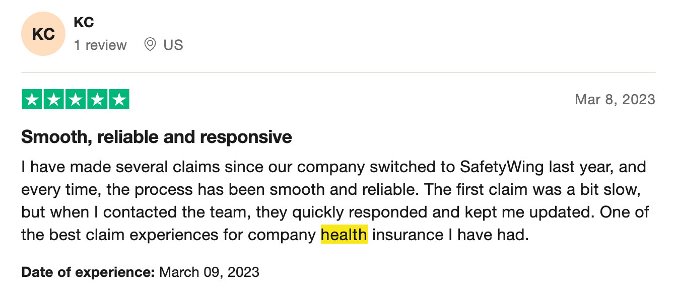
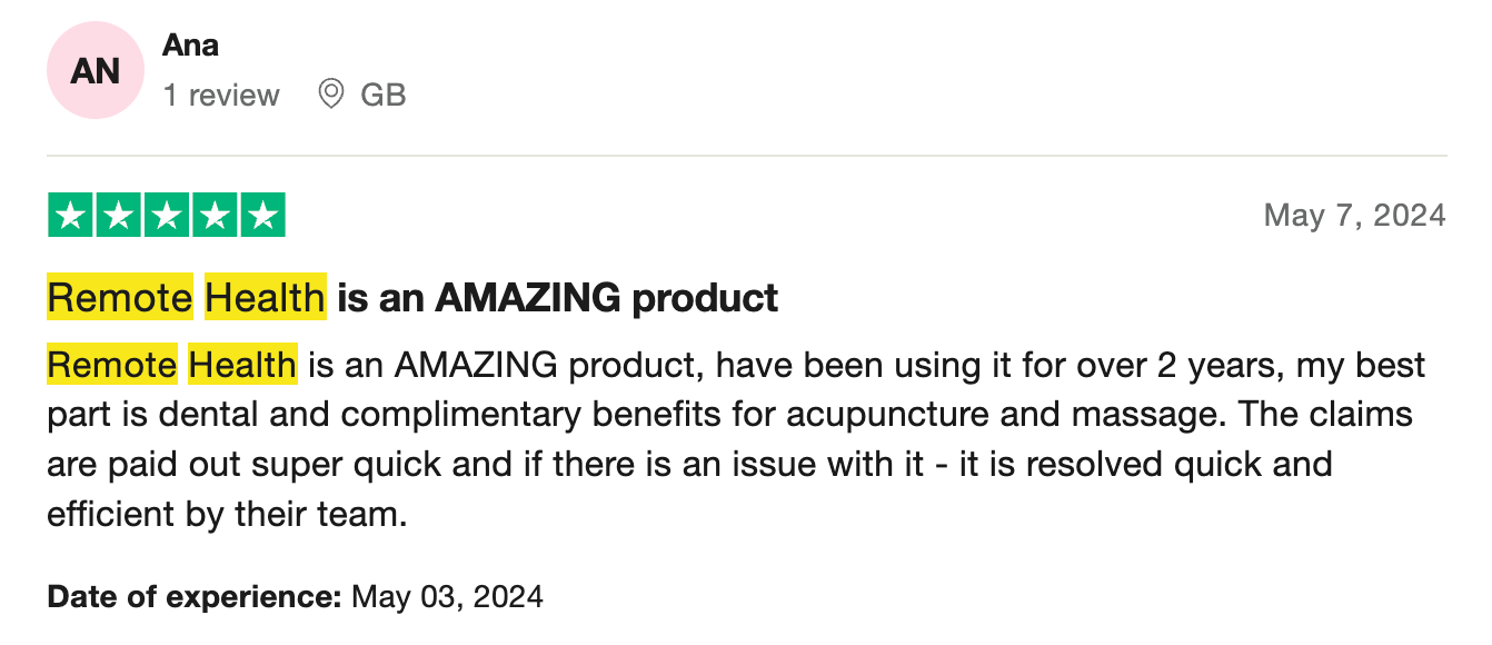
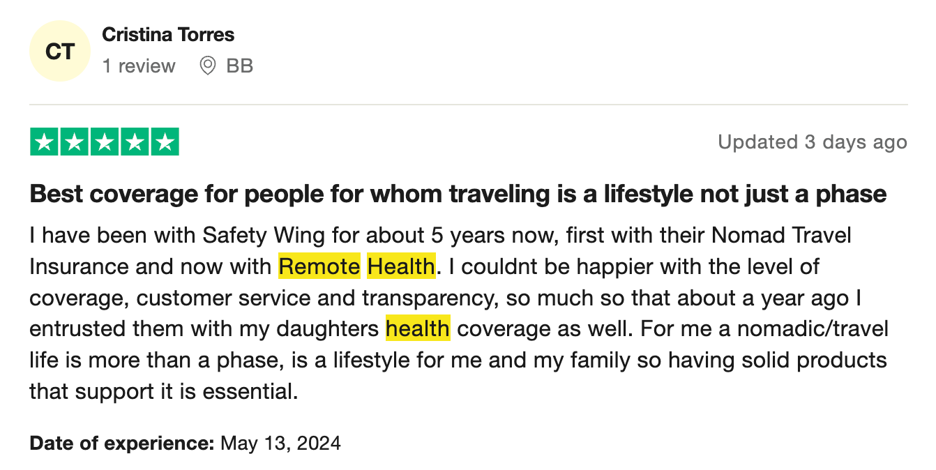
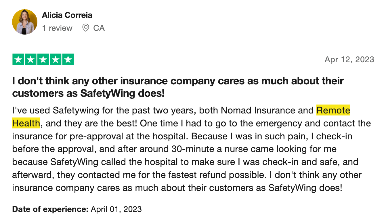
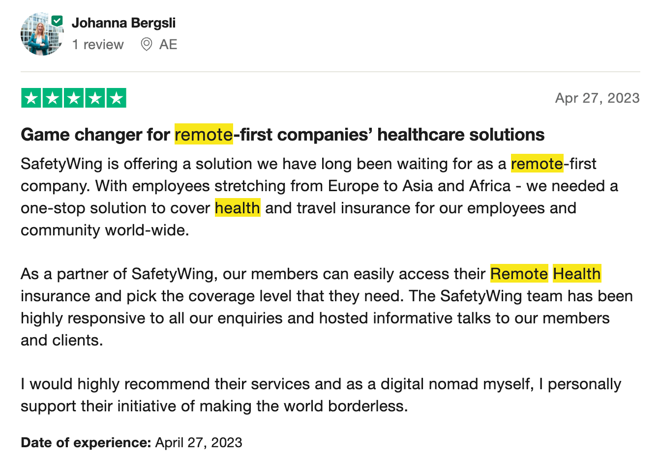
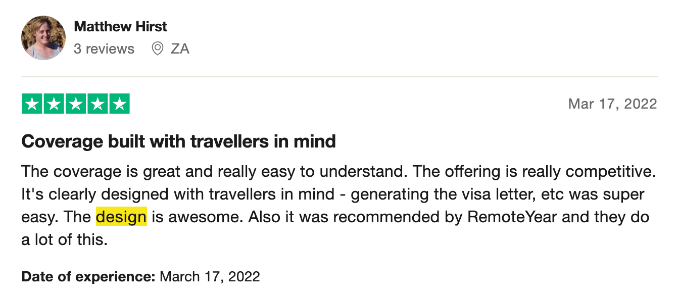
Trustpilot reviews
________________________________________
1
definition of problem
⥥
External
The trend of remote work is on the rise, however, employers face challenges in providing benefits to their employees who reside in different countries. To attract top talent, employers must prioritize fixing their benefits packages, particularly regarding healthcare coverage.
Internal
SafetyWing is a relatively new company that is currently working on establishing its brand. Their first product, Nomad Insurance, provides travel and medical insurance specifically designed for nomads, and they have gained a trusted reputation within the community. However, expanding into a new customer segment with a different lifestyle can disrupt both the current brand and the new product.
________________________________________
2
Concept & discovery
⥥
Living Tower, 1969 (Verner Panton)
As someone with a background in branding and art history, I find it stimulating to draw inspiration from different time periods to keep my ideation and concepts unique. Recently, I stumbled upon the Living Tower by Verner Panton, a communal lounge chair from the late 1960s, and I was immediately drawn to its captivating and romantic aesthetic. There's something intriguing about envisioning the future through the lens of the past.
Moodboard
“If futurism is sometimes called a 'science' bent on anticipating what will come, retrofuturism is the remembering of that anticipation.”
—Elizabeth Guffey
2.1 Why Retrofuturism?
Refresh
SafetyWing is revolutionizing the way people approach healthcare by exploring the intersection of retro or historic elements with futuristic concepts.
SafetyWing is revolutionizing the way people approach healthcare by exploring the intersection of retro or historic elements with futuristic concepts.
Timeless
SafetyWing's ability to seamlessly integrate the past, present, and future is a testament to its enduring value. It serves as a reminder that, no matter how much technology progresses or time passes, dependable healthcare remains a crucial necessity for us all.
SafetyWing's ability to seamlessly integrate the past, present, and future is a testament to its enduring value. It serves as a reminder that, no matter how much technology progresses or time passes, dependable healthcare remains a crucial necessity for us all.
Futurist
SafetyWing is taking a big step towards the future development of its products with Remote Health as its first major initiative.
SafetyWing is taking a big step towards the future development of its products with Remote Health as its first major initiative.
2.2 Interaction
My approach is to fully immerse our users in the retrofuturistic theme by carefully analyzing each element on the canvas and creating interactive touchpoints that enhance the overall experience.
Website flow and interaction sketches
2.3 User Segments
During our brand assessment, we conducted extensive research on various strategies to introduce our latest product, including its name and the unique benefits it offers to our new users. Additionally, we explored fresh visual concepts that could potentially serve as a sub-brand under our company's primary brand. Our analysis revealed that remote companies (B2B) tend to favor a more professional tone with their brand, which contrasts with our nomad brand's (B2C) approach.
Proof of concept
2.4 Brand (Re)strategized
We decided to separate the SafetyWing brand from its initial product to focus on the community and people who use our products for digital nomads and remote workers. We have also developed a new branding strategy for the SafetyWing umbrella brand and its products while maintaining the original colors for the initial product to uphold familiarity and trust with our customers. The new product's colors reflect a certain professionalism that aligns with our retrofuturistic world and represents the new segment well. For our travel and medical insurance, we've named it Nomad Insurance, and for our global health insurance for remote companies, we've named it Remote Health.
2.5 Wireframes
Short-term plan for product positioning and global website
Long-term plan for product positioning and global website
Wireframe for Remote Health homepage
2.6 World Creation & Character Design
In creating the characters for the SafetyWing world, my technique revolves around a comprehensive brief that consistently incorporates the company's core values before embarking on each task. The characters in this world are all birds, drawing inspiration from their real-life counterparts. Each character is meticulously selected from the avian kingdom, with their unique traits and characteristics analyzed to seamlessly align with the scenes and events of the overarching story. For instance, a chicken may be chosen to portray a cranky store owner, while other bird species are assigned roles based on their distinct qualities. To bring the world to life, sometimes, I craft detailed scripts for the illustrators, allowing them to envision the world on a deeper level. Although these scripts don't make it to the public eye, they are extremely valuable in bringing collaborators together to create a cohesive and unified vision.
"If SafetyWing is a planet, its population is birds."
This mockup showcases the retrofuturism theme applied to SafetyWing's bird illustrations. It focuses on the placement, composition, and scale of visual elements. Basic shapes are used as placeholders for upcoming bird illustrations and other supporting graphics created by the illustrator.
Narrative
Each character in this team represents a unique individual, regardless of location or mobility. Their stories vary from seeking inspiration on Mars to taking their newborn on a train ride. Despite the mundane nature of their lives, we prioritize their well-being over their work. Rather than viewing them solely as employees, we acknowledge and celebrate their individuality.
Flow
Non-linear. As you scroll through, each scene reveals a part of the story, but the sequence in which you view them does not determine the overall narrative.
Challenge
The landing page's top section should be able to provide a summary of the whole story, similar to a movie's synopsis. The initial frame conveys to users that a team can consist of just two people, as depicted by two illustrated characters. Additionally, the employee scale demonstrates that even solo remote workers are eligible. The depiction of two different planets represents how users can work from anywhere.
________________________________________
3
Build
⥥
3.1 User Segments
We conducted tests on various ways of presenting, categorizing, and positioning products to cater to different user segments in a way that’s balancing between two of our product values, clear/simple and fun.
More experimentations with grouping and scalability
3.2 Homepage
The homepage of our product was developed in tandem with the creation of its illustrations. Each scene in the illustrations was divided into multiple layers to achieve a scrolling animation with depth.
Product homepage
Optimized for all screens
3.3 Purchase Process
Employers sign up flow
Employees sign up flow
3.4 Supporting Pages
404, FAQs, pricing page
3.5 Profile
Company dashboard
Individual dashboard
3.6 Communications
Transactional email designs
________________________________________
4
Launch
⥥
4.1 Product Launch
Launched on Product Hunt on March 3rd, 2020
4.2 Company Website Launch
Upon launching Remote Health, we also debuted a refreshed company homepage, which presented a chance to rebrand while showcasing our product lineup. We strived to maintain the main brand look from the previous version of the site and thus added the Remote Health link as a button on the navbar.
Updating the company's homepage
Easter egg 🥚: the background color of the hero illustration changes based on your iOS' appearance setting
